How To Style Open Shelves Like A Pro
Everyone loves the look of open shelves, but we often have people ask what to put on it so it doesn’t look cluttered. We usually tell clients to display their favourite items. That could be pictures, souvenirs from travels, books or really whatever. The truth is, the beautiful shelves we see in the media are staged and not actually used functionally. However, there is a way to “stage” functional pieces so it looks good and isn’t just up there collecting dust. In our blog post we will give you a guide of how we styled one of our clients’ open shelves in their dining room.
Photo Credit: First Impression Designs
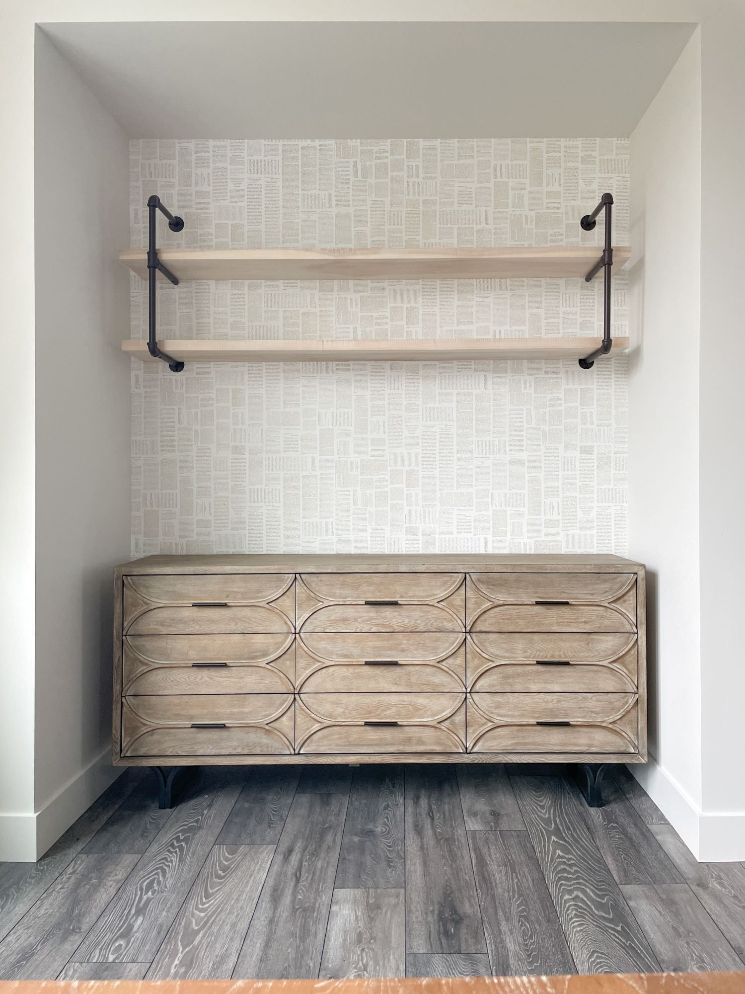
blank canvas
We started off with a blank canvas. We decided to use serving items that may be used once in a while when hosting. We wanted the items to be decorative, but also functional, so once we selected what we wanted to use, we decided to add them in groups. We bought most items new for our clients, but if you look around your home (or do some online browsing, that may turn into shopping) you are sure to find items you may have forgotten you had, since you don’t use them very often. Things such as trays, serving platters, crystal, decanters etc. If you do choose to buy items, make sure they are things you will use! If you aren’t a huge fan of martinis, a cocktail shaker and martini glasses (no matter how cute) may just collect dust.
Photo Credit: First Impression Designs
colour and “special items”
We found these cute, green glasses that we used as the accent colour. The homeowners also had a black, hex serving dish they loved, but didn’t often use. Since most of the items on the shelves will end up being neutral, we decided to place the pops of colour first and in the center, almost as a focal point.
Photo Credit: First Impression Designs
texture
When you think of tableware, it typically comes in fine china or porcelain, maybe stoneware. Either way, their texture is quite similar; smooth, a little glossy and kind of cold. Mix them up with items made of other materials. We used a little galvanized tray and basket as well as added some subtle wood pieces, such as the cutlery and a small cake stand.
Photo Credit: First Impression Designs
height
To ensure variety, you want to make sure to use items not just made of different colours or materials, but also size. We added some pitchers as well as a cake stand on the opposite ends, to balance out the overall composition. A little trick we also like to use is stacking the plates, so it displays the item in a different view and height. Need a bit more height? Add stacked bowls or drinkware next to or even on top of the stacked plates.
Photo Credit: First Impression Designs
greenery
Plants make everything feel more warm and alive. Since the dining room is right off the kitchen, we used little herbs. Great for cooking and garnish.
Photo Credit: First Impression Designs
Don’t forget the area underneath! Though it isn’t directly part of the shelving, it is still all in one visual area. We placed a sideboard underneath and added some other elements that matched the “serverware” theme. Again, playing with colour, texture and height we placed some candles that could be used for a romantic dinner on one side and a tea set on the other. To display the dish, we used a little stand that you can find at Pier 1 or even Michaels to help keep it upright.
Voila, c’est tout. Open shelves are so popular these days and we are all for it. We love showcasing little pops of our clients’ personalities and this is the perfect way to show off the favourite little pieces acquired through the years. Just remember colour, texture, height and greenery (as well as variety and balance LOL) and you will have the perfect open shelf in your own home!
Happy Thursday!


